Windows and Doors Layered Life
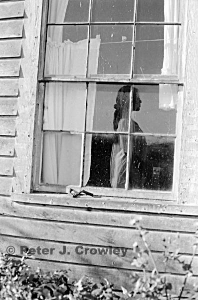 Whidbey Island Wa. Ferry House Layered Life 2001
Photographic Art. Doors I’ve traveled through. New book sample chapter coming soon stay tuned
Fine Art Photographer
by Peter J. Crowley // 1 Comment
Windows and Doors Layered Life
 Whidbey Island Wa. Ferry House Layered Life 2001
Photographic Art. Doors I’ve traveled through. New book sample chapter coming soon stay tuned
by Peter J. Crowley // 4 Comments
So a half an hour ago I started, this post I wrote a paragraph on repetition in the darkroom a must for control of technique. Notes on printing so I can walk into lab years later and quickly match a print. But repetition, technique in the Piss me off Pixel Age is difficult as Upgrades, Changes, Distractions and the constant need to babysit this inhuman box. Too much brain power diverted from creativity to keeping up with marketing the homogenization of thought. Be an individual just do it with the latest AI. [FU AI.] like everyone else. WP deleted my words and added 6 images I uploaded to the Lib. appeared in post. I must have missed the latest new and improved version.
A Life in Photographic Art a second book Forty Five years seeking the highlight finding the Muse.
2013 Taftville Ct the Ponemah Mill.
April 5th 2013
The next image, always the next image here in 2013 or
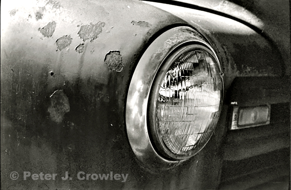 here 2016 an old perhaps ’50s truck up the street from me. The string that ties the journey, the images, is seeing beyond the stylized bright color. Tri X the tie that binds.
enjoy pjc
Photographic Art A six minute look at the life and times of light emotion
A life in Photographic Art my second book
A Life in Photographic Art will have some thoughts on composition, technique but more words on emotion and seeing. Composing with and sharing you soul. A few poems, essays sarcasm and humor it is after all my life.
Subject Photography sure it is important to get your subject correctly but does that mean in the center of the frame? What about the rest of the image? Now you have your subject where you want them beautiful smiling face legs cut off by the bottom of the
frame a few inches of nothing above. But she looks great. What surrounds the subject is at least 50% of the images importance. The negative space directs the viewers eye creating eye motion resulting in a longer look.
Motion the image may be still but by implying motion and understanding eye movement your images will speak with a more compelling voice.
Where to crop when composing Never at wrists or ankles, an arm cut at the wrist leading out of the frame will take the viewers eyes with it, same with ankles.
When the subject is moving…..
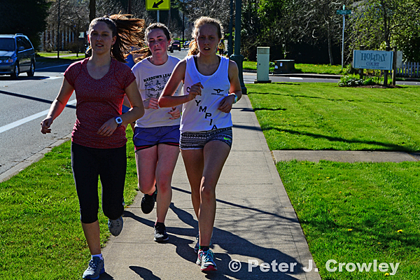 Like here walking down North St. Digital camera and 85mm F1.8 Nikkor lens. Manual Glass. A test for my eyes and Technique see the light on hair frame focus expose. I miss the shot, lens is sharp and my quickness is good BUT where do the runners step next? When subject is moving there must be landing space.
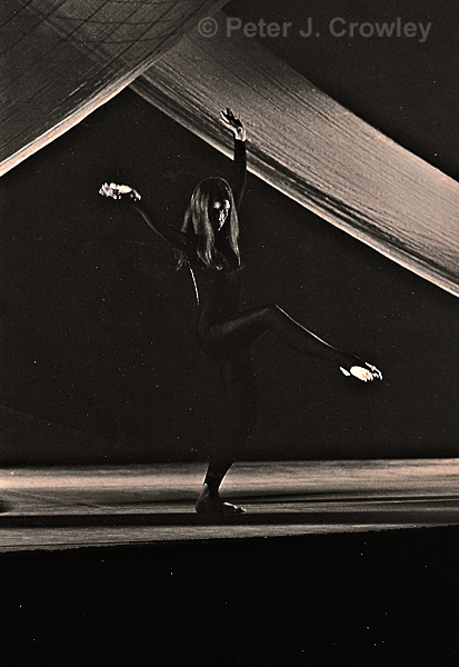
Here she has a space to land and the feel is much better. The runners neg space is also interrupted by the arrow sigh growing from the head of one of them. Yes I could take it out but that is not me. I see and shoot full frame what is in the image I put there. It is a way of seeing the way I see. The dancers negative space the web carries the same motion as the leg holding the viewers eye in the frame. A series of triangles moves your eye around the photo blocking you from moving to the next page.
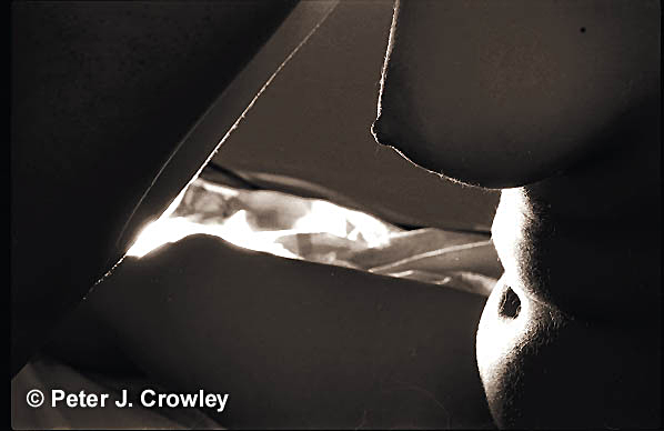 More triangles and DOF hold the attention. I have been seeing lots of soft focus lately Bokeh catchy new term DOF. Many images are just out of focus but online never say anything except wow great Bokeh yes a missed focus still impresses your FB Friend. I think some company is now selling not sharp lenses to create an “effect.” In the 70’s when soft focus was popular you could buy filters. I used to compose by breathing on my skylight filter and shoot as the moisture dried. If I wanted center focus I would put a dime on the filter then breath. Thought problem solving but there is an App for that.
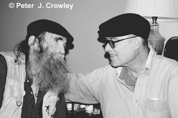 An early digital conversion to B+W muddy gray and gray with a slight color cast. The first post of this was quite black and blue as the whites went to blue. Still when posted it was the most popular post in a long time. Better now but still with a magenta cast to whites and still muddy. I asked for guidance to improve my B+W. The consensus was $$$$ buy a program or two get an app. I pondered and thought read and some blogs and viewed a few tutorials most telling me to buy $$$.
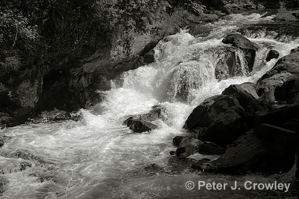
The River here is Digital the figure above is film both printed warm tone as I would in the darkroom it is close but it isn’t art till it is on paper. This is how I prep B+W images for the web. Be it a film scan, a digital shot in color or in B+W I open the image in PS Elements 10 and convert to B+W, open enhance click on adjust color and color variations move slider to left the smallest adjustment. Then take out 2-4 Blues why cause they are there despite what the scan being B+W or image created in Mono mode it is still color. Take a sheet of white paper and hold it next to the highlight of your image. If my wandering around the internet reviewing photos can be believed that highlight will be light blue in 80% or a few % magenta. Contrast and tonal range to get a black and a white and 5-7 tones in between. I use the modified Zone system for 35mm. Adams set the zone for 10 grades using an 8×10 negative. Thirty Five mm film will most likely hold 7 zones. Is your monitor calibrated? Not cause the kid at Best Buy said so but is it? Of course you can buy software to do this I was lucky to have a friend with a spider. So a few years back my desktop was done. I know it is still good because I have this to compare a gray scale from Gerald at the Black and white forum http://www.bwphotographyforum.com/index.htm see bottom of page. On my laptop I have a portrait of me down on 8×10 film I measure from the top of the screen to the J on the keyboard which is the correct angle of view to see a calibrated image. This angle is critical so your process is repeatable and reliable. As in film process exact repetition creates consistent results.
The Zone System is about controlling correct exposure. Recently I saw a program being touted as the Zone System for light room? I laughed another program BANDAID, for photographers too busy to get exposure right. I’m waiting for the cell phone app.
Auto photography and zoom lenses causing faulty technique. At first I thought it was digital and auto everything that was the starting point for this problem but the more I ponder the more I see blame spread out. Example you are photographing a portrait with a 28-105 zoom you stand in one place and focus on subject full length just zoom out just face zoom in never moving hence never looking beyond the subject. Not realizing the prospective and DOF change and when focal length changes or the changes in the negative space keeping your sights locked on the eyes. Failing to experience 50% of the image. By using prime lenses you are forced to see the surroundings as you walk closer. Here you are forced to see the interaction between the subject and the environment/negative space. You create this relationship you make an image.
Photographic Art More thoughts on composing
enjoy pjc